mobile:hidden class in Tailwind CSS
By @samuel · 2021-11-26 16:24 (edited)
mobile:hidden class in Tailwind CSS
The standard way of hiding elements on mobile in Tailwind CSS is using something like:
hidden sm:block
However, that requires you to know and re-define the normal display setting. Because there is no universal class for this
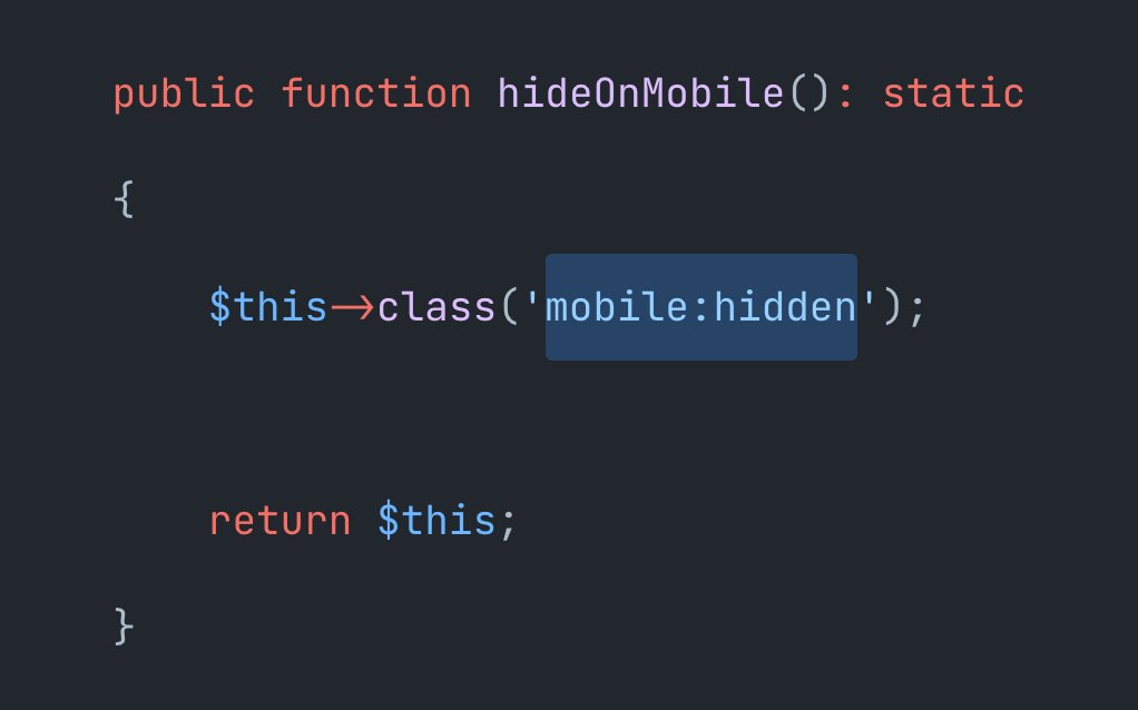
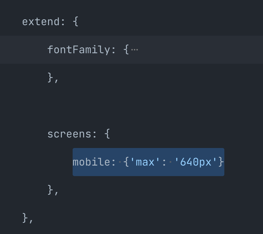
So we've added this to a project yesterday:
With mobile being a new screen size that's defined as the inverse of sm — rather than min-width 640px, this uses max-width 640px.
This is reposted from our Twitter account as it's a valuable and longer-form tip.

